How to write comparison pages AI assistants quote
Want more buyers and sales from AI search, without doing the work? Let the IYDigitals team handle it. Talk to an expert now →
On this page
- Why comparison pages matter more now
- The anatomy of a page AI will quote
- Pages AI ignores and pages AI quotes
- A template you can follow
- A note on “alternatives” pages
- Which comparison pages to write first
- Staying fair and safe
- Mistakes we see most often
- Make the pages work for sales too
- How comparison pages fit the bigger picture
- Measure what the pages do
Some of the most valuable questions a software buyer asks are comparisons: “Is Paystack or Flutterwave better for a subscription business?” “What are the best alternatives to Zoho Books in Nigeria?” “HubSpot vs Zoho CRM for a 20-person sales team?” The person asking is close to a decision. They already know the category. They want help choosing.
More and more of those questions go straight to ChatGPT, Perplexity or Google’s AI. The assistant searches the web, reads the comparison pages it finds and builds an answer.
If your page is the one it reads and trusts, your framing of the decision becomes the buyer’s framing.
This guide explains how to write comparison pages that AI assistants quote and buyers believe.
Why comparison pages matter more now
Comparison searches have always converted well, because the buyer is close to choosing. AI raises the stakes.
An assistant answering “X vs Y” needs a source that has already done the comparing, and it tends to lean on pages that match the question closely and make clear, checkable statements.
Industry analysts such as Siege Media have reported that versus pages are strongly associated with AI search traffic.
Treat the exact multipliers you will see quoted online with caution, but the direction is consistent: pages that directly answer comparison questions get used.
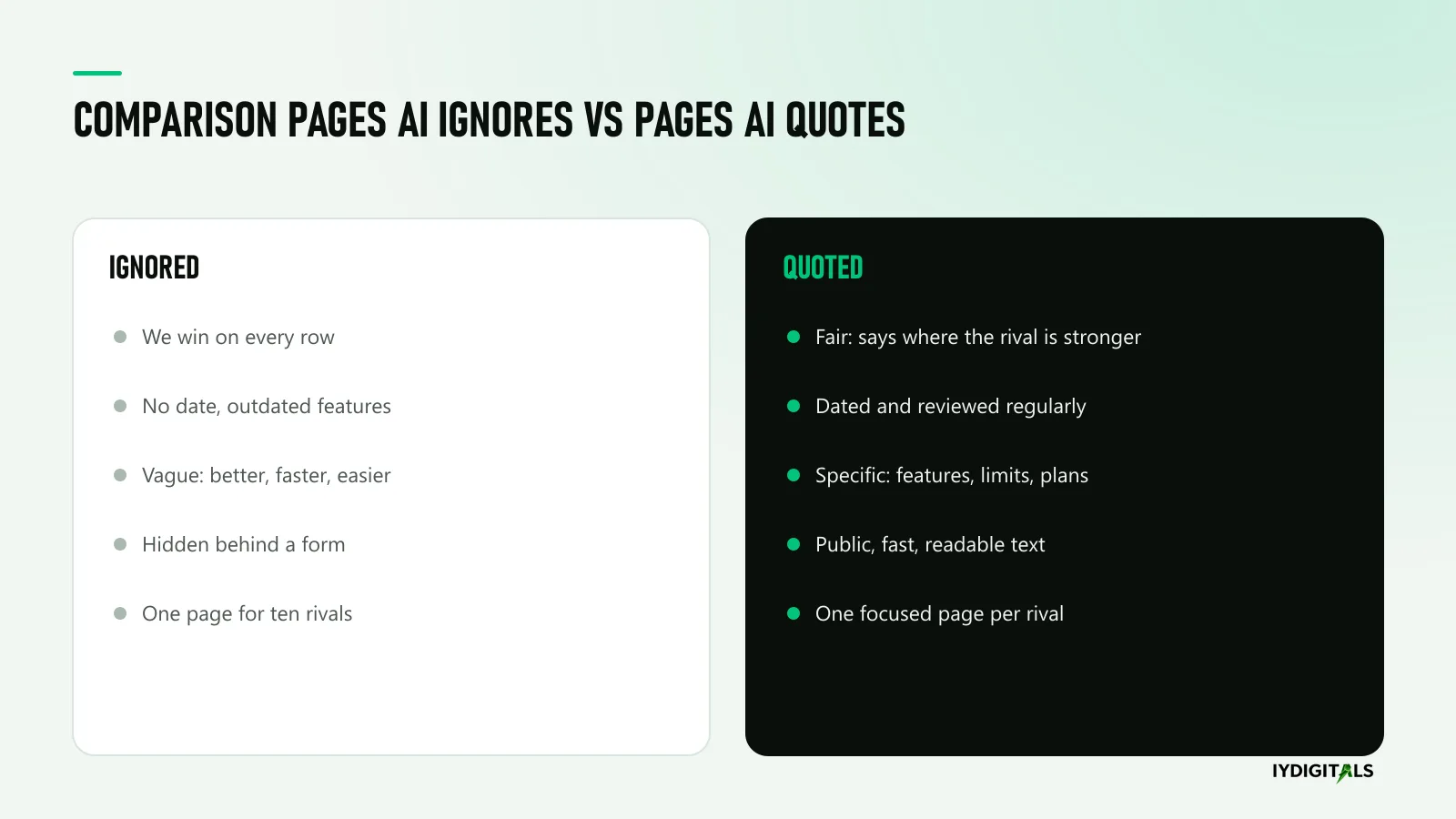
There is a catch. Assistants are increasingly good at spotting a page that is really an advert. A comparison where your product wins every row reads as biased, and biased sources are easy to skip.
The anatomy of a page AI will quote
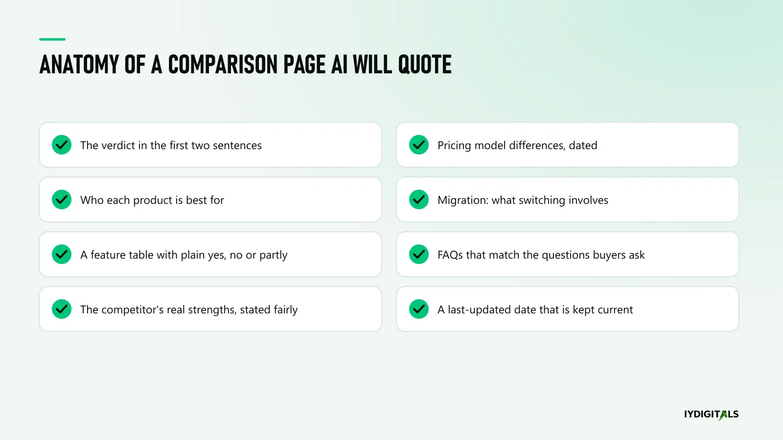
1. The verdict first
Open with the answer in two sentences: who should choose which product, and why.
For example: “Choose [your product] if you run a Nigerian SME that needs naira invoicing and local payroll compliance.
Choose [competitor] if you are a multinational that needs deep ERP integration across many countries.” That is exactly the kind of sentence an assistant can lift into an answer.
2. Who each product is best for
Buyers don’t want the “best” tool; they want the best tool for them. Spell out the company size, industry, market and use case each product suits.
This also helps assistants match your page to specific questions, such as “for a 20-person team” or “for schools”.
3. A clear feature table
A table with the features buyers actually compare, marked plainly as yes, no or partly, with a short note where it matters.
Avoid vague ratings like “better” or “advanced”. Tables are easy for people to scan and easy for machines to read.
4. The competitor’s real strengths
Say honestly where the competitor is stronger. It feels uncomfortable, but it is what makes the page credible.
Buyers who have trialled the competitor will notice if you pretend otherwise, and so will assistants comparing your page with others.
5. Pricing model differences, dated
You don’t need to publish exact prices if you don’t want to, but explain how each product charges: per user, per transaction, by plan or by usage.
Add the date you checked the competitor’s public information, because pricing changes and outdated claims damage trust.
6. What switching involves
For buyers already using the competitor, the real question is “how painful is it to move?” Explain data migration, onboarding time and any help you offer. This section often decides the deal.
7. FAQs that match real questions
Use the questions your sales team hears on calls: “Can we import our data from X?” “Does it work with Paystack?” “Is there a local support team?” Answer each in a couple of sentences.
8. A last-updated date, kept current
Show when the page was last reviewed, and actually review it. A comparison from two years ago describes products that no longer exist in that form.
Pages AI ignores and pages AI quotes
A template you can follow
Here is the outline we use for a “[Your product] vs [Competitor]” page. Adapt the headings to your category, but keep the order.
- Title: “[Your product] vs [Competitor]: which is right for [buyer type] in [market]?”
- The short answer (2 to 3 sentences): who should choose which, and the main reason.
- At a glance: a table with 8 to 15 rows covering core features, integrations, support, markets served, pricing model and set-up time.
- Where [Competitor] is stronger: two or three honest points.
- Where [Your product] is stronger: two or three specific points, with evidence such as a screenshot, a documentation link or a customer quote.
- Who each is best for: company size, industry, market, use case.
- Pricing models compared: how each charges, with the date checked.
- Switching from [Competitor]: what moves across, how long it takes and what help you offer.
- What customers say: a short quote from a customer who switched, with permission.
- FAQs: four to six real questions from sales calls.
- Next step: a demo or trial offer aimed at switchers.
- Last reviewed: the date and who reviewed it.
Write it in plain language. A buyer should be able to read the short answer and the table in under a minute and know whether to keep reading.
A note on “alternatives” pages
“Alternatives to [Competitor]” pages work a little differently.
The searcher has usually decided the competitor isn’t right: too expensive, too complex, missing a local feature, poor support in their region. They want a short list of credible options.
The pages that get quoted list several genuine alternatives, including ones that aren’t yours, explain who each suits and are honest about the trade-offs.
It can feel strange to recommend other products on your own website, but a page that only lists you isn’t really an alternatives page, and both buyers and assistants treat it that way.
Put your product first if it genuinely fits the reader best, explain why in specific terms, and let the rest of the page earn trust.
Which comparison pages to write first
- Your product vs the competitor you meet most often in deals. Ask your sales team which name comes up most. Start there.
- Alternatives to the category leader. Many buyers search “alternatives to [big global tool]” when it is too expensive, too complex or not built for their market. A fair page listing several alternatives, including your own, is often quoted.
- Your product vs doing it manually. “Payroll software vs spreadsheets” is a real comparison for many African SMEs, and few competitors write it well.
- Category guides for your market. “Best accounting software for Nigerian SMEs” with honest criteria. You can include your product, but the page must be genuinely useful.
Staying fair and safe
- Use only facts you can verify from the competitor’s public website, documentation or your own testing.
- Date every claim about the competitor, and review the page regularly.
- Avoid disparaging language. Describe differences; don’t attack.
- Don’t use the competitor’s logo or branding in a way that suggests endorsement.
- If the competitor corrects a fact, update the page quickly. It is in your interest to be right.
Mistakes we see most often
- Burying the answer. Three paragraphs of company history before any comparison. Buyers and assistants both give up.
- Comparing features nobody cares about. Twenty rows on things your product happens to do, and nothing on what buyers actually ask about.
- Screenshots instead of text. A comparison table saved as an image can’t be read by most machines. Use real HTML tables.
- Gating the page. Asking for an email before showing the comparison. Assistants can’t read it, and buyers leave.
- Forgetting the page exists. A competitor launches a feature, your page still says they don’t have it, and a buyer notices on the call. Diary a quarterly review.
- One page for ten competitors. A long “us vs everyone” page rarely matches a specific question. Focused pages do.
Make the pages work for sales too
A good comparison page isn’t only for search. Your sales team can send it to a prospect who says “we are also looking at X”.
Customer success can use it when a competitor tries to win back a client.
Link each comparison page from the relevant use-case pages, and give it a clear demo or trial call to action that speaks to the switcher: “See how your data moves across in a 30-minute demo.”
How comparison pages fit the bigger picture
Comparison pages work best as part of a set.
Your homepage says what you are; use-case pages say who you serve; comparison pages say how you differ; reviews and third-party lists say what others think.
When all of those agree, assistants describe you consistently and buyers arrive already understanding where you fit.
If you are new to this shift, our explainer on GEO vs SEO: what changes when buyers ask AI sets out how AI answers differ from traditional search results, and why clear, verifiable pages matter more than ever.
Measure what the pages do
Each month, ask ChatGPT, Perplexity and Google the comparison questions you wrote pages for.
Note whether your page is cited, whether your verdict is reflected in the answer and whether your product is named.
In analytics, watch AI referral traffic and demo requests that land on comparison pages. Our guide on checking whether AI assistants mention your business explains a simple tracking routine.
Comparison pages are one part of a wider plan for winning more demos from AI search. If you would like help building yours, see how we work with SaaS companies, look at our client results, or book a free strategy call.
Common questions
Is it fair to write about a competitor on our own website?
Yes, as long as what you write is accurate, current and fair. Stick to verifiable facts, date the page, acknowledge where the competitor is stronger and avoid disparaging language.
Check your competitor's public information before you publish and review it regularly.
Should we write one page per competitor or one big comparison?
Start with one focused page per main competitor, because buyers ask about specific pairs. A broader "alternatives to X" or category comparison page can sit alongside them.
Will an honest page that admits a competitor's strengths lose us deals?
Usually the opposite. Buyers have often used or trialled the competitor already, so they trust a page that gets the facts right. It also filters out buyers who were never a good fit, which saves your sales team time.
How often should comparison pages be updated?
Review them at least every quarter, and whenever you or the competitor ship a major change. Show the last-updated date on the page.

Visibility & Conversion Strategist